The thorough research which we carried out at the beginning of the project is what fuelled our concept. From researching alternative TV packages and technologies to conducting a questionnaire and looking at different users, ensuring we concentrated on both Baby Boomers and Millennials, we have established a real understanding of key behaviours around TV viewing. Our research taught us that casual TV viewing (i.e. unplanned or spontaneous TV viewing) was popular within both targeted groups. This led us to our 'Live TV recommendations' concept which would support and encourage casual TV viewing by recommending shows which were 'on now' based on the users viewing and recording history, creating a new customer experience that would serve both audiences identified in the brief.
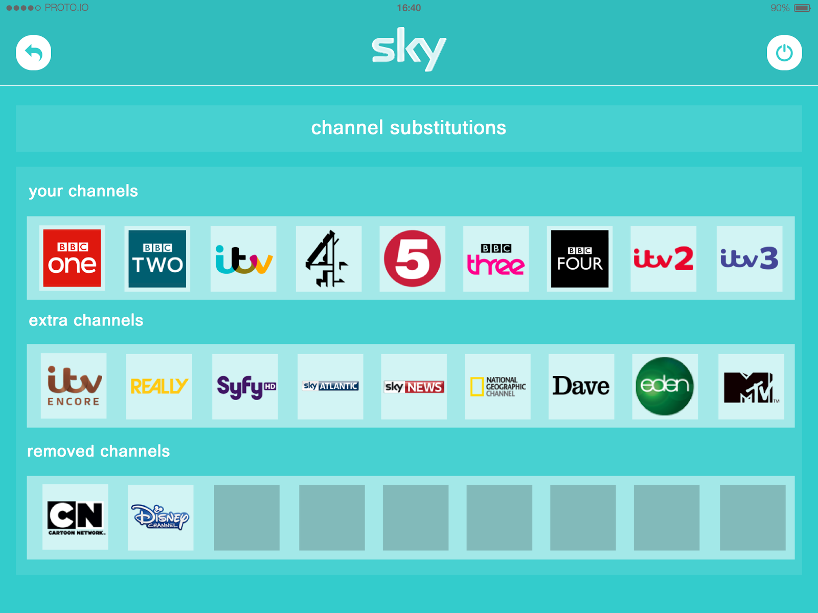
We ensured that our concept was user focused by gaining strong audience insights from our research. The micro profiling element to our concept ensures that the service would be individually personalised to each user, rather then to a whole family. We think this, along side other personalised features including recommendations and popular TV within their demographic, would result in the service gaining popularity and being accepted by both Baby Boomer and Millennial users. Not only do we think that our concept would benefit customers, but we think it would be viable for business. Personalising recommendations would encourage users to watch more of their favourite shows, allowing Sky to learn more about their consumers and therefore increasing customer engagement with the brand. The credit system, that rewards customers with credit with a monthly underspend encourages users to explore the Sky box office more regularly and could lead to the purchase of additional movies and gives customers and incentive to have a more expensive package. Giving channel substitutions allowing customers to exchange channels they don't watch for ones that they do gives an extra level of personalisation to the Sky service and could result in users viewing more regularly by having access to channels they prefer; resulting in a more bespoke service.
We created a storyboard and filmed a narrative to convey our vision. We based the scenario around a family situation as our research taught us that this demographic is the most likely to have a Sky subscription and would benefit from our concept the most. We aimed to achieve a personalised service which would give users more of the TV they love. We feel that we have achieved this through our concept and established this within our finalised narrative.
We designed our prototype through trial and error, beginning with simple wireframe sketches and finishing with a clean and simple user friendly interface. We responded well to feedback, ensuring we explored all points suggested for improvement, which has led us to create a visually pleasing application prototype with a strong value for customers.
We ensured that our concept was user focused by gaining strong audience insights from our research. The micro profiling element to our concept ensures that the service would be individually personalised to each user, rather then to a whole family. We think this, along side other personalised features including recommendations and popular TV within their demographic, would result in the service gaining popularity and being accepted by both Baby Boomer and Millennial users. Not only do we think that our concept would benefit customers, but we think it would be viable for business. Personalising recommendations would encourage users to watch more of their favourite shows, allowing Sky to learn more about their consumers and therefore increasing customer engagement with the brand. The credit system, that rewards customers with credit with a monthly underspend encourages users to explore the Sky box office more regularly and could lead to the purchase of additional movies and gives customers and incentive to have a more expensive package. Giving channel substitutions allowing customers to exchange channels they don't watch for ones that they do gives an extra level of personalisation to the Sky service and could result in users viewing more regularly by having access to channels they prefer; resulting in a more bespoke service.
We created a storyboard and filmed a narrative to convey our vision. We based the scenario around a family situation as our research taught us that this demographic is the most likely to have a Sky subscription and would benefit from our concept the most. We aimed to achieve a personalised service which would give users more of the TV they love. We feel that we have achieved this through our concept and established this within our finalised narrative.
We designed our prototype through trial and error, beginning with simple wireframe sketches and finishing with a clean and simple user friendly interface. We responded well to feedback, ensuring we explored all points suggested for improvement, which has led us to create a visually pleasing application prototype with a strong value for customers.