
The log in page displays each family members profile and personalised colour scheme. The user would select their profile and log in using a 4 digit passcode or the fingerprint scanner if they have this feature. Profiles can easily be added by selecting "add profile". We chose not to use upper case letters within our design, as you will see through out the interface screens. We based this decision on the aesthetics on the existing sky brand, and feel that it makes for a more balanced layout.

This is the main user or bill payers home page. This user will have access to all pages on their My Sky account so they can view their bills, package and orders in one convenient location. In response to our feedback we added descriptions of each page for user convenience as well as adding detail to the icons, which we agree makes the design more aesthetically pleasing. Though we did experiment with adding complimentary colours to the design we felt that it over complicated the interface. We did however, give each individual user their own colour scheme, doing this not only injected some colour into the interface, but also further personalised the experience for the user. To log out of their account users would simply select the 'Off' button on the top right hand corner of the screen.

This is the 'My Hub' page which includes the users name, photograph and hours of free recording time. We chose to put all family members free recording space on each page mainly for aesthetic reasons. However, we also thought it would be useful to implement a recording space 'donation' system whereby users could give recording space to other users who may require extra. We chose to show this data both in graph format and visually, which also helps to add some colour into the design.
At the top of this page is the users personalised live recommendations which are displayed in a carousel format. In theory when a user selected "watch now" the show would automatically play on their television set so that the iPad takes the place of the TV remote. At the bottom of the screen their is "recommended viewing" this would display general recommendations, which would become more personalised over time as the system learns more about the individual users viewing habits. Users could opt to record or set a reminder and this information would link directly to their TV's, so again the iPad would take the place of the remote.
Another feature we included was the "popular now" segment which would display top ranking recommendations from within the users demographic, thus making the Sky experience even more personalised. Other features include buttons to take users to their recordings/ reminders, as well as an option to view the TV guide. This was something we initially missed out of our design, which we have rectified thanks to our user testing. We realised without an option to see the guide, users could not view what was on in order to make recordings or set reminders.

When the 'TV Guide' is selected users can view whats on TV now as well as being able to scroll along to see what else is on that day.

When a programme is selected an overlay appears displaying the time the show is on and a brief synopsis of the programme. From here users can choose to set a recording or reminder. When a reminder is set the overlay will disappear and a small alarm clock icon will appear on the top right corner of the box. When a recording is set a small pay button will display in the same position - this is depicted further down in the post.

On the 'My Package' page users can view what features they have within their current package as seen on the left hand side. Users can also view their monthly subscription cost, as well as their remaining credit. When setting up their Sky accounts users would set a budget for their Sky service and any remaining funds could be redeemed through box office movies as displayed on the right side of the design.
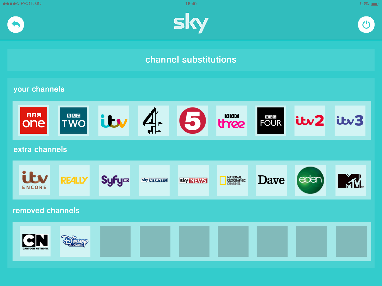


The four screens above display the 'substitutions' feature that we have included within our concept, which is located within the 'My Package' page. Upon selecting 'Chanel Substitutions' users will see their current channels, the extra channels they could swap in, and their removed channels. In order to add an extra channel users would first have to remove one of their existing channels. This is done by holding down the icon of the channel they wish to remove. This would then change to a blank box and the option to add an extra channel would appear in the form of a small plus sign. Users would then select the channel they wanted to add and its icon would fill the blank box. Not only could this process be fulfilled manually by the user, but as Sky learned about the users viewing habits channel swaps would be made automatically, thus giving users more of the TV they love.

Once again, this is the My Sky home page. This displays how users can personalise their accounts by having an individual colour scheme. This user is not the bill player, and so does not have access to the 'bills & payments', 'my package' or 'my orders' pages, illustrated by the dark background. This would ensure that no unauthorised charges would be made.


The four screens above display the 'My hub' page, 'TV Guide' and the record option, personalised to a different user.
No comments:
Post a Comment